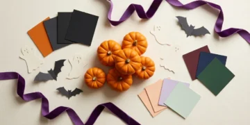



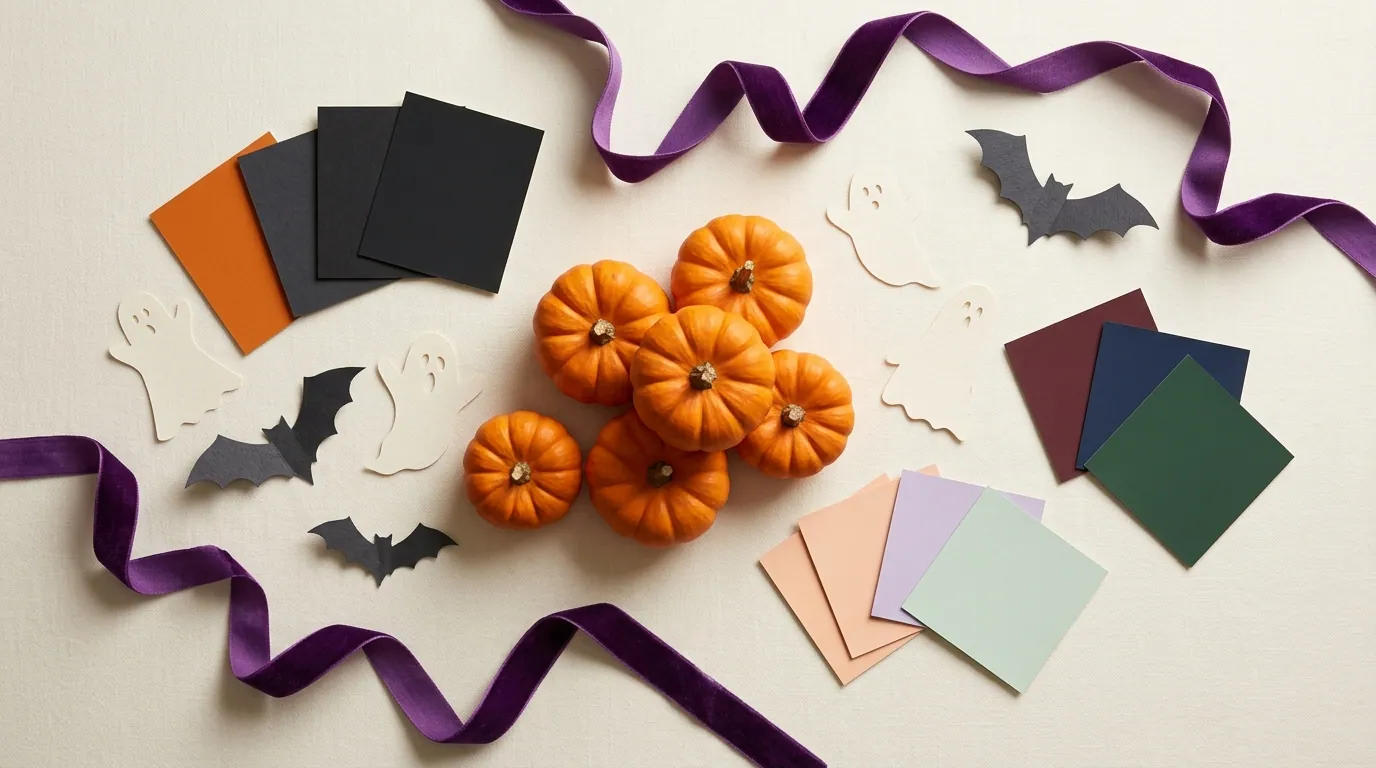
A Halloween color palette is easier to use when you know the mood you want. For a familiar look, start with orange and black, then add cream or purple. For something softer, try peach, lavender, and mint. Burgundy and charcoal offer a darker option.
Below are 10 combinations with hex codes and ideas for where each color can go. These codes identify digital colors. They don’t guarantee an exact match in paint, markers, fabric, or print, and every possible text-and-background pairing won’t be readable.
Choose a palette for the project you’re making, then test one small sample before using it everywhere.
Direct answer:
A Halloween color palette is a group of colors used together for seasonal designs. Start with orange and black for a familiar look, or choose pastel, dark, or neutral shades to match your project.
10 Halloween Color Palettes and How to Use Them
This table gives you a starting point. The sections below include the codes, suggested color roles, and a useful detail to watch.
| Palette | Mood | A suitable starting project |
| Pumpkin Classic | Familiar and bold | Party invitation |
| Pastel Ghost | Soft and playful | Cute ghost illustration |
| Vintage Harvest | Warm and muted | Autumn display |
| Witch’s Potion | Bright and mysterious | Potion-label artwork |
| Candy Corn | Cheerful and simple | Treat-bag tag |
| Gothic Rose | Dark and romantic | Dinner menu |
| Moonlit Teal | Cool and eerie | Haunted-house graphic |
| Haunted Forest | Earthy and shadowy | Woodland-themed decor |
| Pink Midnight | Pink with dark detail | Party sign |
| Cocoa and Bone | Quiet and neutral | Simple mantel display |
The palette names are descriptive labels for these examples. Use the codes when you want the specific digital shades shown here.
1. Pumpkin Classic
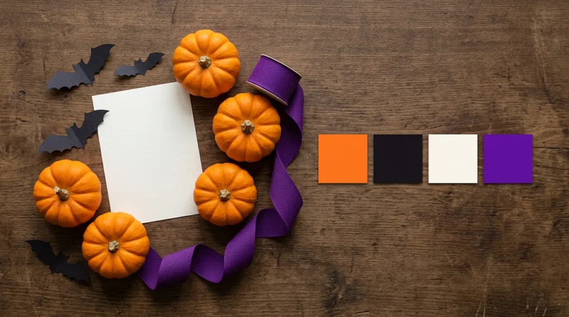
- Pumpkin orange: #FF7518
- Near-black: #17131B
- Warm ivory: #F9F6EE
- Rich purple: #6A0DAD
Start here if you want a familiar Halloween look. Orange carries the pumpkin theme, while near-black gives shapes and lettering a clear edge. Ivory provides a lighter place for important details.
For example, make an invitation with an ivory background, near-black event information, and orange pumpkins. Add purple to a border or a few stars instead of giving all four colors equal space.
You can also use orange as the background with near-black text. Keep purple away from small lettering on that orange unless you check the pairing first. A palette can work well as a group even when some combinations are better suited to decoration than text.
2. Pastel Ghost
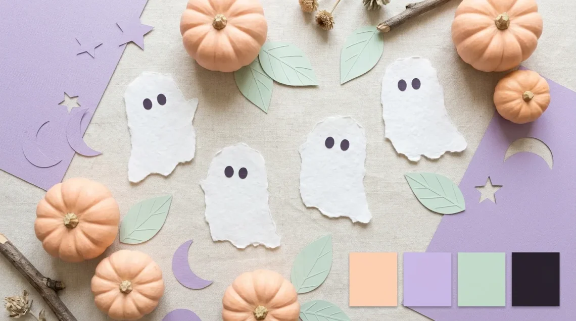
- Soft peach: #FFD1B3
- Dusty lavender: #CBB7E8
- Pale mint: #BFDCCB
- Deep charcoal-purple: #292331
This pastel Halloween color palette suits cute ghosts, friendly pumpkins, and gentle seasonal artwork. The dark fourth color gives faces, outlines, and words a clear role.
Try lavender behind a ghost illustration, peach for pumpkins, and mint for scattered leaves. Use charcoal-purple for the message and small facial details. The lighter colors can stay in the decorative parts.
The main risk is letting everything become equally pale. A peach word on a lavender background may look pretty as swatches but become hard to read at a small size.
Keep the mood soft through the large color areas. You don’t need pale text to make the whole design feel pastel.
3. Vintage Harvest
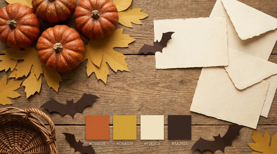
- Rust orange: #C65D2E
- Mustard gold: #D5A339
- Aged cream: #F2E2C4
- Deep brown: #3A2923
Choose this muted Halloween color palette when bright orange feels too sharp for your project. Rust and mustard give it warmth, while aged cream and brown suggest an older print style.
For a sample poster, use cream behind brown lettering. Place rust pumpkins near the edges and save mustard for a moon or a few small details.
This combination can also guide an autumn display with brown baskets, cream paper decorations, and orange accents. Start with items you already have rather than trying to match every object exactly.
Too much brown can hide the rust details. Place a lighter area between similar dark shades when a shape needs to stand out.
4. Witch’s Potion
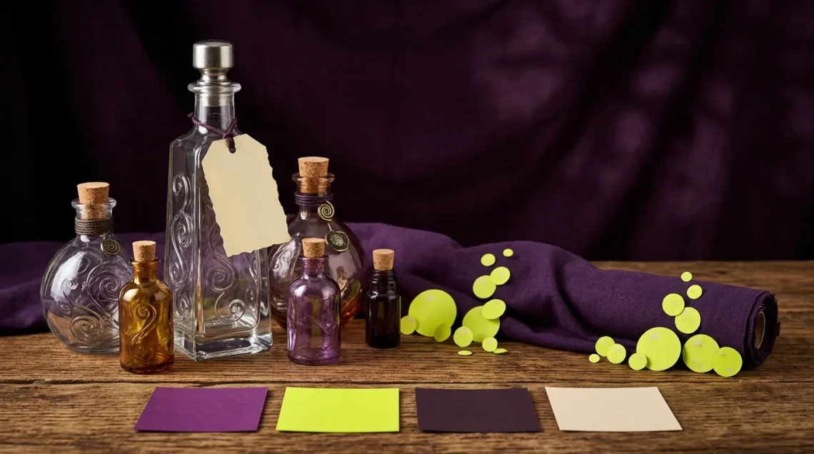
- Potion purple: #6B3FA0
- Bright yellow-green: #A8D948
- Blackened plum: #1E1728
- Pale parchment: #F5F0E8
Purple and yellow-green make a lively witch-inspired combination. Blackened plum creates a dark base, while parchment gives you a useful surface for labels.
For example, design an illustrated potion bottle with a plum background, green bubbles, and purple shadows. Put its name on a parchment label with dark lettering.
The green works best when it has a clear job. If bubbles, borders, headings, and every small detail all use the brightest color, nothing gets much emphasis.
Keep purple for larger supporting shapes and let green mark the details you want people to notice first. This gives the palette energy without making every part compete for attention.
5. Candy Corn
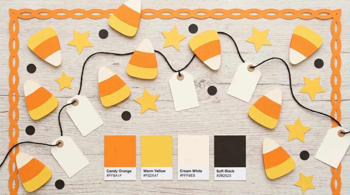
- Candy orange: #FF8A1F
- Warm yellow: #F5D547
- Cream white: #FFF6E8
- Soft black: #2B2523
Orange, yellow, and cream make a cheerful choice for treat tags, candy illustrations, and simple party graphics. Soft black gives the warm colors a practical text option.
Imagine a cream tag with dark lettering, an orange border, and a small yellow star. You get the candy-inspired effect without placing several bright colors behind the words.
This palette is also easy to reduce to three colors. Keep cream, orange, and soft black if yellow doesn’t add anything to the design.
Watch the boundary between yellow and cream. Those areas may need a dark outline when you want separate shapes to remain clear, especially in a small printed illustration.
6. Gothic Rose
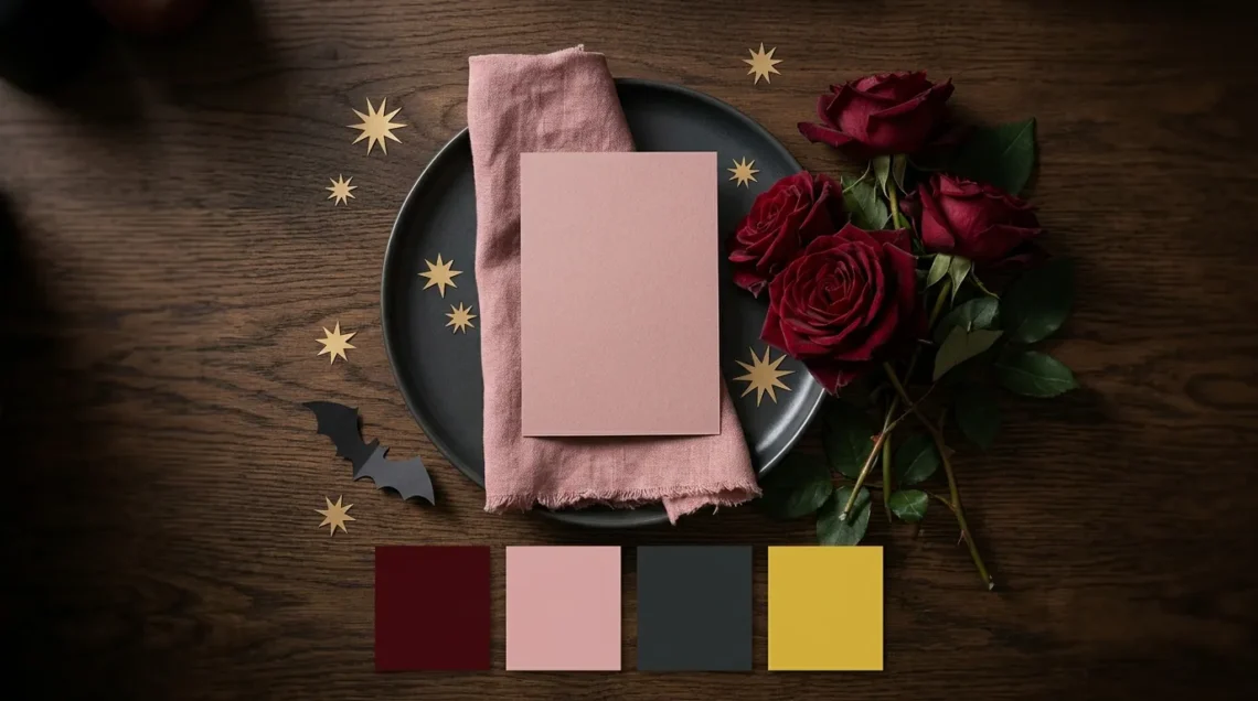
- Deep burgundy: #6E1838
- Dusty rose: #D9A0AC
- Dark charcoal: #201A24
- Muted gold tone: #C7A45C
Gothic Rose suits a darker dinner menu, a floral invitation, or a romantic Halloween theme. Burgundy brings depth, while dusty rose offers a softer area for words and details.
For example, use a rose background with charcoal text, then add burgundy flowers and a thin gold-toned border. Try the text pairing in a contrast checker before settling on small type.
Burgundy and charcoal are both dark, so don’t rely on that pair for fine details. Give important information a lighter surface.
The gold code is a flat digital color. It won’t create reflective foil or metallic ink by itself. If you want that finish in print, discuss the actual material with your printer.
7. Moonlit Teal
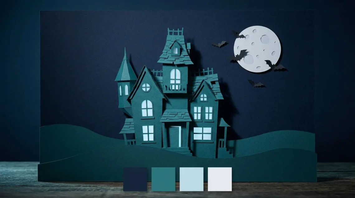
- Night navy: #16243A
- Deep teal: #2A7F86
- Pale moon blue: #BBDDE7
- Cool off-white: #E8EAF0
Use this cool combination for an eerie night scene without orange. Navy can carry the sky, teal can separate buildings or trees, and pale blue can suggest moonlit edges.
For a haunted-house graphic, place the house against navy and give windows a pale blue glow. Reserve off-white for the event name or another detail that needs attention.
Teal and navy may blend together in small areas. If the roofline disappears, add a pale edge or change the size of the shape.
This is also a useful direction when you want Halloween artwork that feels quiet rather than playful. Let a few recognizable shapes establish the theme.
8. Haunted Forest
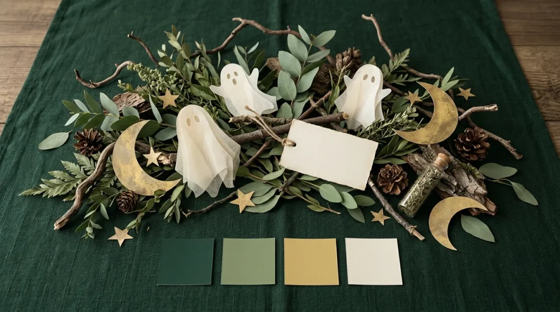
- Deep forest green: #183D32
- Muted leaf green: #82966A
- Weathered gold tone: #D6B86C
- Soft ivory: #F2EADB
Haunted Forest gives you an earthy alternative to a pumpkin-led scheme. It can suit woodland illustrations, paper decorations, or a table setting built around green items you already own.
Try an ivory menu with forest-green lettering and leaf-green branches. Use the gold tone for a small moon, border, or decorative symbol.
For a room display, compare the palette with the actual wall and furniture colors before adding more green. A small arrangement may give you enough seasonal detail.
Without Halloween shapes, the colors may read as general woodland decor. A bat, crooked tree, or ghost silhouette can make the intended theme clearer without changing the palette.
9. Pink Midnight
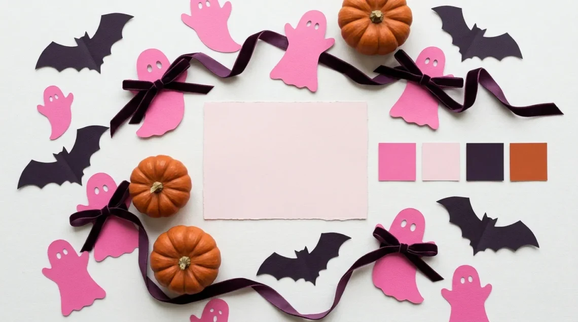
- Bright pink: #E66BA7
- Pale blush: #F7C9DE
- Dark plum: #2A1834
- Burnt orange: #C45123
Pink Midnight keeps pink at the center while adding darker structure. Burnt orange gives the combination a warm seasonal detail without taking over the whole design.
For example, make a blush party sign with dark plum words, bright pink ghosts, and small orange pumpkins. Repeat the orange in just a few places so it feels connected to the rest.
If you want a stronger look, increase the dark plum area. For a gentler result, let blush cover more space.
Avoid treating this as a palette for one age or gender. Choose it because you like the color balance and because it suits the project you’re making.
10.
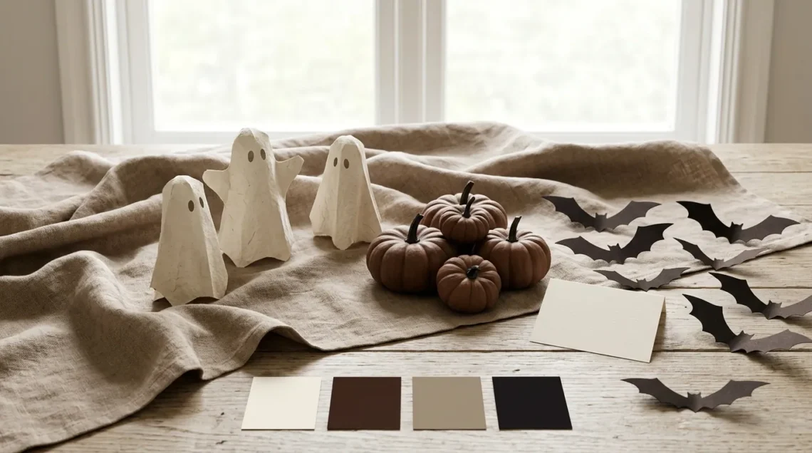
- Cocoa brown: #4A3028
- Warm taupe: #B79B88
- Bone cream: #F4EBDD
- Brown-black: #1F1B19
This neutral Halloween palette works as a starting point for simple paper decor, quiet illustrations, and displays that need to fit a warm room.
For example, pair cream paper ghosts with dark brown bats and a taupe background. In a digital design, cream words on cocoa can provide a clear light-dark pairing.
Cocoa and brown-black sit close together visually. Use one as the main dark color instead of expecting fine details between them to stand out.
The seasonal feeling comes largely from the objects and shapes you choose. Without those details, this combination can look like an everyday neutral scheme, which may be useful if you prefer subtle decoration.
Choose a Palette for Your Mood and Project
First decide what the project needs to do. A decorative picture can give most of its space to shapes and color. An invitation must also make the date, location, and other details easy to find.
For a familiar Halloween look, Pumpkin Classic is a useful starting point. Pastel Ghost offers a softer direction. Vintage Harvest and Cocoa and Bone can fit warmer surroundings, while Moonlit Teal gives a cooler night-scene effect.
Then consider what you already have. If a room contains pink textiles or green walls, try a palette that includes a related shade. You can add seasonal details without replacing every background color.
For digital art, ask where the viewer should look first. A bright accent can guide attention, but it loses that role if you spread it across everything.
For invitations and signs, choose the text-and-background pair before adding decorative colors. A design that looks attractive as four squares may still need a different arrangement to carry information clearly.
You also don’t have to use all four colors. Remove a supporting shade if it adds clutter. Keep enough difference between the remaining colors to separate the background, message, and main detail.
If you’re unsure between two palettes, make the same small design in both. Comparing the actual project usually gives you more useful information than comparing swatches alone.
Give Each Color a Job
A hex code is a digital color label, often written as a hash sign followed by six letters or numbers. The six-digit form describes the red, green, and blue components of a color. For example, #FF7518 identifies the orange used in Pumpkin Classic.
If your design app has a hex color field, enter the code there. Choose that field rather than a box intended for another color system. Check the resulting swatch before continuing.
Next, assign the colors simple roles:
- Background: The large area behind your design.
- Text: The color carrying the information.
- Supporting color: A second color for larger illustrations or shapes.
- Accent: A color used in smaller details to draw attention.
These are starting roles, not fixed rules. The important point is that each color helps the design do something.
To make a three-color version, keep one background color, one readable text color, and one decorative color. With Pastel Ghost, for example, you could keep lavender, charcoal-purple, and peach, leaving mint out. If you later add another color, give it a specific purpose. A second accent isn’t necessary just because it appears in the original palette.
For example, imagine a Pumpkin Classic invitation. Use ivory behind the page, near-black for the date and location, orange for a large pumpkin, and purple for a few stars. The information stays together, and the decorative colors have separate jobs.
If the page feels busy, reduce the number of accents before adding another shade. If it feels flat, try changing the size or placement of an existing color.
A Halloween color palette generator can help you explore alternatives. Coolors’ official generator guide documents keeping a chosen color while generating others. Treat the results as ideas, then check the combinations you actually use; a generated palette doesn’t guarantee readable text.
Check Your Colors on Screen and in Print
Check Text Against Its Actual Background
Contrast is the difference in lightness between colors. For text, it helps determine whether the words stand apart from the background.
The W3C’s contrast guidance sets a minimum ratio of 4.5:1 for normal digital text at WCAG Level AA. WCAG means Web Content Accessibility Guidelines. Large text has a lower threshold under specific size conditions, so 4.5:1 is a useful starting check for ordinary text.
Using the W3C formula, near-black #17131B against orange #FF7518 gives approximately 6.82:1. White #FFFFFF against that same orange gives approximately 2.69:1. The dark pair passes the normal-text threshold; the white pair doesn’t.
These calculations apply to those solid, opaque color pairs. A photograph, gradient, or transparent layer can change the background behind the words.
Check the finished design at the size people will see. If details disappear, try a simpler background, stronger lettering, or a lighter or darker text color.
When colors communicate information, add words or another clear cue too. For example, label different ticket types rather than distinguishing them only with colored dots. W3C guidance explains why information should not depend on color alone.
Test Paper, Paint, and Other Materials Separately
Screens and printed materials create color differently. Adobe’s color-mode guidance explains RGB for screen display and CMYK for process-color printing, with results affected by working spaces and printing conditions.
For a print project, ask your printer which file settings it needs. Check one sample before ordering a larger batch. Pay attention to pale details, dark areas, and important lettering.
For markers, paint, or fabric, compare actual samples under the light where you’ll use them. A descriptive name such as “pumpkin orange” isn’t enough to guarantee the same shade across products.
Make the sample useful: include the actual lettering, a light detail, and a dark area instead of printing only large color blocks. If a detail disappears, adjust that part and check again. For a physical display, place a few chosen materials together before buying more. You’re checking whether the combination works in its setting, rather than whether every item matches a screen perfectly.
Halloween Color Palette FAQs
What Are the Halloween Colors for 2026?
For a 2026 project, the palettes above are design options rather than an official yearly list. Choose according to the look you want. This guide doesn’t rank colors by nationwide sales, search interest, or measured popularity.
Are Halloween Palette Names Official?
The names in this guide are descriptive editorial labels. Other designers may use the same name for different combinations. Save the hex codes alongside the name when you want to keep a specific digital palette, and keep physical samples separately for material matching.
How Can I Adapt a Halloween Palette for a Wedding?
Start with the mood and the venue’s existing colors. For example, Gothic Rose could guide floral details and stationery, while Cocoa and Bone could support a quieter setting. Give menus and signs a readable text pair, and compare fabric, flower, and paper samples together before making larger purchases.
Start With One Small Design
Choose one palette and try it on a small invitation, illustration, or display. Give each color a clear role, check the words, and compare any physical samples. Once that small version works for your purpose, use it to guide the rest of the project.
Disclaimer:
These palettes are design suggestions, and their names are descriptive labels. Hex codes identify digital colors; print, paint, fabric, and marker results may differ. Check your actual text-and-background combinations and test physical samples before larger orders.